Data Correlation in B2B Marketing Analytics
Learn the importance of data correlation in B2B marketing analytics and how it can enhance your marketing strategies. Key insights & best practices inside.
Correlation vs. Causation
Correlation occurs when no cause and effect can be established between two variables that have a relationship. For example, the level of education of parents is positively correlated with the salary levels of their children. In other words, higher levels of education of parents has been observed in higher salary levels of their children. However, this does not mean that a direct causation can be established. If that were the case, to increase your salary level, you would simply have to get your parents in schools and universities. Another such example of correlations exists between heights and weights. Your height is not causing your weight but taller people tend to be heavier than shorter people.
Causation means that there exists a cause and effect relationship between two variables. In the education example, a direct relationship may exist between education level of a child and the average salary he earns. Someone who just completed an undergrad and someone who just finished an MBA might get different salaries even at the same experience level regardless of their parent’s education levels.
Correlation ≠ Causation
It is important to be able to distinguish between causations and correlations. The best way to differentiate the two is to consider all other factors that are involved in the outcome. For example, there exists a strong correlation between the data for ice cream consumption and murders. This correlation is a complete coincidence. But if you were to apply causation, it becomes worse because then it implies that ice cream consumption leads to murder.

Applying causation in less subtly absurd correlations can be even more harmful, especially if budgeting decisions are based on cause and effect relationships between touch-points. Ideally, most data analysts avoid establishing causations. First, because its hard and correlations are easier to establish. Second, direct causations are very rare.
Correlations in B2B Marketing Analytics
Establishing correlations and causations is fundamental to any and all data analysis. Marketing analytics is no exception to this. Correlation insights help marketers make sense of their data points. In turn, this contributes to optimizing marketing efforts and determining the impact of marketing on KPIs and revenue.
In other words, correlation analytics identifies valuable patterns within the story, your marketing data is trying to tell you. Here’s how:
1. Understand the impact of your SEO/PPC
2. Test campaign decisions during implementation
3. Determine the revenue impact of customer touchpoints
There can be several pitfalls to correlations data, particularly in cases where coincidences can be mistaken for statistically significant relationships. Some can be very obvious, others are not so much. For example, there exists a strong correlation between the number of pool drownings and films that Nicholas cage has appeared in through the years. Another perfect correlation is between total revenue generated by arcades and CS doctorates awarded in the US. But as is plain, these events have nothing to do with each other.

Let’s take a marketing example. Say a company decides to mail catalogs of their retail products to their target audience in Karnataka. Soon after, they Ef a stark rise in orders placed from Odisha. Intuitively, the right move would be to send more catalogs to Odisha to support the growing demand for your product. However, as a result of the strong relationship between the two touch-points, correlation analytics would suggest shipping catalogs to Karnataka instead.
Best Practices for Correlation and Causation in Marketing Analytics.
Avoid confirmation bias
Confirmation bias in correlations data occurs when your data inaccurately confirms a bias. Say, a preferred channel is performing better than another and a correlation that confirms your belief, you are likely to assign causation that isn’t there.
Anish is the marketing head of Company X. He recently had a celebrity promote X’s product. He worked hard on getting them on board and was sure that it will drive sales. Soon after, he noticed a spike in the number of website redirects from Facebook and immediately assigned the causation for this increased traffic to the celebrity’s campaign. Expecting similar results, he invests further resources and runs another ad with the celebrity. However, there is no change in performance. There is something amiss in the marketing head’s correlation analytics. Instead of checking for causation, he let your subjective assumptions take over. This is confirmation bias in play.
To assign definitive causation, it is necessary to check for coincidences. In this example, tracking performance data for the campaign across channels is a good way to assign cause to the campaign. Simply put, if the celebrity is affecting more people to click on this ad, then there should be a percentage increase in clicks in all channels that carried the ad with the celebrity. So Anish should’ve tried to corroborate the results, keeping all other things (like the intent of the target audience) constant across all platforms (Google, Facebook, Instagram, etc). On running such an analysis, he notices that only Facebook had a spike in traffic after the first ad, which wasn’t replicated across other platforms or even on Facebook itself when the second ad was shared. On further research, he learns that the platform had made changes to its algorithm around the same time, which seems to have impacted all ads on Facebook, including X’s.
Using quantitative data from all channels can help avoid making decisions or causations around subjective assumptions.
You can use a marketing analytics tool like Factors can help you check how a touchpoint is helping or hurting pre-determined conversion goals. The funnel feature allows you to customise your queries to check for specific correlations. Funnels can be created for website redirects, and in this example, the celebrity ad could be compared across channels in a few clicks and Anish could check whether to attribute the change to the celebrity ad or if there’s something else at play.
A/B testing
One of the best ways to establish effective correlation is A/B testing. Let’s say you’re revamping your website homepage and want to test the impact on traffic and conversions. A/B testing involves testing a variable (for example, the position of a “schedule demo” button). This change is tested across two-time frames — pre-change and post-change.
Let’s change the previous example and assume that the spike in Facebook redirects did not happen immediately after running the ads but happened a few weeks later. In the absence of a proper pre and post analysis, it is human nature for Anish to attribute it to the ad campaign. But if he did a pre-and post-analysis of the impact of ad campaign on redirects, he might find that the cause for the change is something else.
You can use tools like Factors.AI to record changes like new ads when they occur and use data from the various channels like Facebook as well as your website or conversions to A/B test campaigns. The funnel feature allows you to use campaign naming conventions to get data pre-change and post-change.
Analyse the impact of correlations across channels.
Looking out for correlations and establishing possible causations can help understand how a specific touchpoint is affecting pre-determined conversion goals. If you want to check impact on goals like say, web event sign-ups, white paper downloads or even deals won, you can use correlation and causation analytics to figure out what touchpoints are saying, helping you schedule demos, what touchpoints on your website is driving down form fills, etc.
Factors allow you to compare metrics on a week on week basis to catch changes in any of the metrics. The explain feature allows you to check for what URLs or web pages your users have visited before submitting a form. Apart from identifying URLs that have influenced the users to convert, you can also see which webpages aren’t performing well. Weekly sessions data can help see short term changes, apart from A/B testing. Correlations can also be checked at a segment level, like demographics, industries, business model types, etc.
Choose the right graphs for correlation analysis/reporting
Data collection is only the first step to understanding correlations. The second step is to read the data and share the insights. After getting the insights, you act upon the data as well as build data-driven strategies. To understand how a touchpoint is interacting with each other and the impact of a change on your conversion metrics and revenue, you can use graphs.
There are several kinds of graphs that can be used for correlation analysis.
Time-series graphs:
These reports compare metrics over time periods. They are most appropriate for trends or changes in metrics post a change in a touchpoint or campaign strategy etc.

Distribution Graphs:
These graphs can easily show when there is a correlation. They show changes in distribution against a mean.
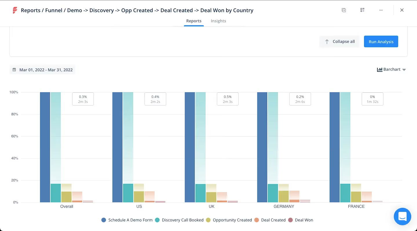
Funnel comparison graphs:
These graphs can be used to see a side by side comparison of funnel queries. Say you want to see how ad 1 and ad 2 have impacted the conversions, you can see a side by side strategy comparison of the two. You can also compare the same funnel before and after a specific time period.
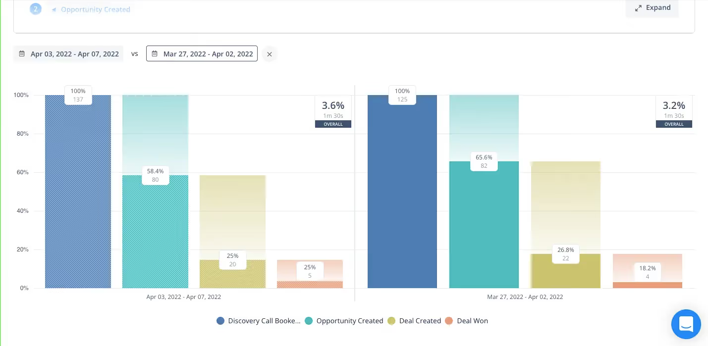
There are also other graphs like relationship graphs that help see the relationship (positive, negative or nil) between two or more metrics.
B2B SaaS marketers struggle with revenue attribution for a reason. The journey is long. The data is scattered. And the models do not always tell the full story. Factors.ai breaks this down into eight mistakes that show up again and again.
Many teams start without a clear attribution strategy. They depend on single touch models like first click or last click even when the buyer journey has ten touchpoints in between. Sales and marketing data do not line up, so the picture stays blurry.
Some teams miss offline or multi device interactions. Others use old or siloed data that cannot keep up with how buyers behave today. Mid funnel touchpoints like content and nurtures are ignored. And attribution models stay generic instead of being shaped for the business.
The final mistake is not testing and optimizing. Attribution is not a one time setup. It needs validation and iteration.
Factors.ai solves this with AI driven attribution designed for B2B SaaS. It pulls data together. It reads the full journey. And it gives teams the clarity they need to spend smarter and market better.
In closing...
In the age of data-driven marketing, it is important to know how to treat your data. Every customer journey and every touchpoint weaves a larger story where the channels are connected and touchpoints impact each other to influence each potential customer to convert. Correlations can help bring forth these insights that are invisible to the naked eye and can help you craft a winning marketing strategy for your organisation.
See how Factors can 2x your ROI
Boost your LinkedIn ROI in no time using data-driven insights
See Factors in action.
Schedule a personalized demo or sign up to get started for free
LinkedIn Marketing Partner
GDPR & SOC2 Type II


.svg)


.avif)

.avif)

.svg)


